CD123
-
Posts
16 -
Joined
-
Last visited
Content Type
Profiles
Forums
Events
Everything posted by CD123
-
Regina Transit has a Master Plan Survey underway! There's also a section on the consultation to share and "like" ideas for transit, How could we improve your daily transit experience? Quick and easy way to throw some ideas to the planning team - was an opportunity to resurrect a suggestion for a grid network I brought up over 10 years ago on another forum! I mentioned on the consultation that Edmonton recently decided to revamp their bus network starting this April from really loopy routes that maximised coverage (just like Regina) to a mix of frequent straight routes on major roads in the core, with suburban routes that leverage frequency in peak periods. I think Regina would be amenable to that now.


-
Sign for northbound 80 on Holland near Fisher Park school incorrectly lists Barrhaven Centre as the destination. Just a block up on Holland near Byron, it's correctly listed as Tunney's Pasture. Odd mistake to make - the signs should all be identical all along Holland, it's as if someone deliberately went out of their way to substitute in the wrong destination.


-

Misc. OC Transpo & STO Questions & Discussion
CD123 replied to SMS's topic in National Capital Region
Nice work! I'm surprised that STO hasn't yet updated their signs to Sentence Case as the two major systems in the area (i.e. STM and OC) have. Besides the case change, omitting the partitive articles ("de la", etc) as you've done also improves legibility when it allows for larger text (though when it doesn't, keeping them actually helps). -
The "leaping line" swoosh matches the old visual identity as along the top of the old bus stops and information signs, the SPECIAL security cars, Powerpoint templates, etc. As you said, too many elements, trying to cram in a bit of everything. It's unfortunate they used it on the LRVs knowing the visual identity was changing to the "O" - a scheme like the middle left one here would have been more consistent with the buses, both new and old. That looks exactly right - segments of the "O" instead of the red/gray "swoosh", just like on the vending machines and station decor.


-
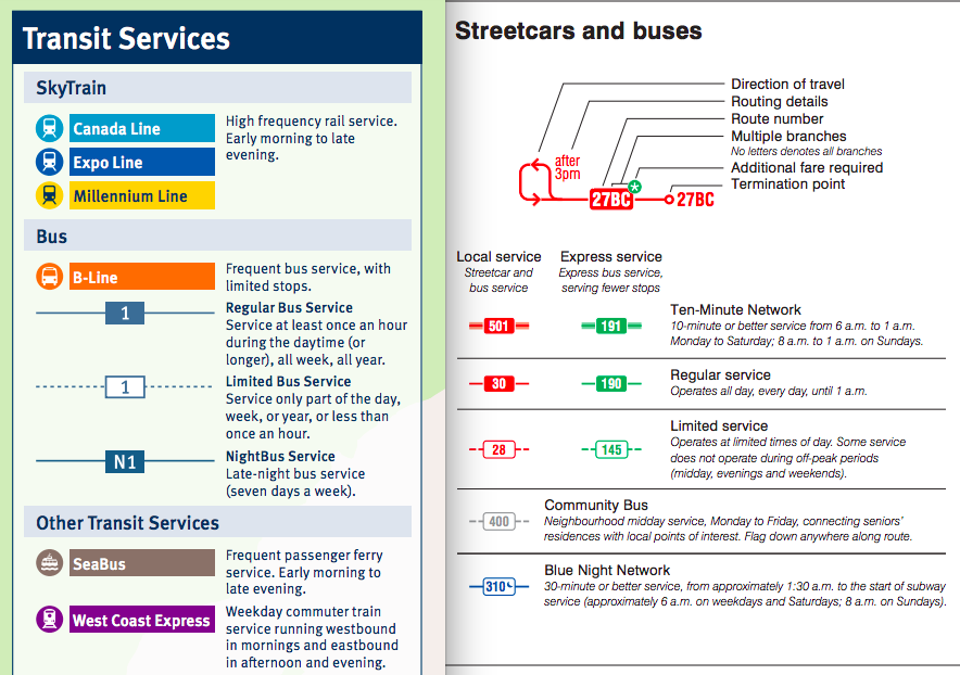
Exactly - it is a mistake to make the system more complicated unnecessarily. A user should not have to check multiple sources to understand the meaning of the symbol, and when exceptions apply that change the meaning to the opposite (i.e. coloured background = all day service, except when the colour is purple, then coloured background actually means peak service only). For example, the Vancouver and Toronto bus symbols (attached) are much simpler: regardless of the route type (local, express, community), and whatever colour system is used, a white background always lets the user understand that service is not throughout the day. (To be fair, I think rest of the system is actually pretty clear; and the route numbering by neighbourhood is an extra bit of info that's sometimes helpful, that I've only seen here in Ottawa.)

-
I thought we already agreed to disagree I do see what you mean, but "consistency in regards to their own service" is not the best practice in usability: it complicates the symbols because you're adding another level of knowledge to understand the meaning. The explanation signage itself states limited service "runs only during certain times of the day, or on certain days of the week", which is exactly what Connexion is, hence why I still see the use of solid background as a mistake. Best practice in any wayfinding system is for symbols to have consistent meanings across all usage, not to force the user to know the exceptions. You have a point with the limited Connexion service though - for clarity, those exceptions where service is so limited (even less than peak weekdays) would warrant an actual text explanation on the stop sign. I agree that school, shopper and special events could warrant indications other than the Local style boxes - actual text explanations would probably be the clearest way to indicate those as well.
-
I think we're talking about different things. What I'm getting at is being consistent when marking stops as having limited service or not, when limited service (as defined by OC Transpo on the explanation sign) is "runs only during certain times of the day, or on certain days of the week". I don't think that's intended to capture when service becomes less frequent though remains throughout the day. For example, the 101 westbound is regular service up to Bayshore, but services beyond that only on the peak morning/afternoon periods. So where I board in the morning to get to work, the 101 is on a black background; but where I get off at Carling Campus, it is on a white background. Thus, the limited service portion is appropriately marked. Similarly, because Connexion routes only run during weekday peak morning/afternoon periods (i.e., "runs only during certain times of the day, or on certain days of the week", as per OC Transpo's explanation), they should be on a white background, for consistency.


-
We might have to agree to disagree. Sure, individual routes might be marketed differently because they have different purposes (different "markets"), but the marking system overall still should be consistent - the overall public "product" is the entire transit system. Put it another way: what is the benefit of deviating from the rule that white background = not full time, or conversely, what is the harm in being consistent? Just because there are alternative ways to get the correct meaning doesn't justify going to the effort of carving out an exception for Connexion routes. Again, it's a basic design principle that markings in a system have consistent meanings - therefore, I still strongly consider this a mistake.
-
It might be the case that people who already know the system know the exceptions to the rule, but it's a basic design principle that signage should consider the perspective of the new or infrequent user, and that markings should have consistent meanings. Just because "the people who need to know will know" doesn't justify the error. There is no benefit in complicating the system by carving out an exception to Connexion routes by marking them with a solid background, when there's already a way to mark these non-full time routes that is more clear (i.e., white background). For example, Shopper routes, which are marketed as non-full time service like Connexions, are marked with white backgrounds. Regular users might already know these aren't full time, but being consistent makes the system more understandable for infrequent or new users, who are necessary to growing transit use.

-
That seems to needlessly complicate the system: would be simpler to just be consistent on the solid background = full time, white background = limited service convention. That way you don't need to learn Connexion routes are a special exception to the rule. It's also misleading at first glance: makes it look like there's more service at a stop than there really is. By being more clear that service is limited (remember, not all stops have schedules or maps to give those details), it's more helpful especially to new/infrequent users.
-
Route 86 maps say "All day service" and "Périodes de pointe seulement" Connexion routes have solid purple ovals, but they only run during peak periods, so they should have a white background like other part time routes New LRT livery has a "swoosh", which was the previous OC Transpo visual identity (as on the old bus stop signs). The current visual identity is the big red O; alternatively, the LRT livery should have been the same as the bus design (white, red maple leaf, gray band along the bottom) as in the left centre mockup below


-
New route maps also starting to go up at stops. Some peculiarities with the new 86 local map, e.g. Tunney's Pasture marked with connection to (1), but not Hurdman (or LeBreton/Pimisi); and "All day service" in English, but in French, "Périodes de pointe seulement".